OVERVIEW
Clearly Surely is a platform designed to educate users about life insurance.
It uniquely compares 7 distinct product classes — a feature unmatched by any other provider in the space.
DURATION
Oct 2019 - Mar 2020
MY ROLE
UX/UI Designer
Illustrator
2D Animator
TEAM MEMBERS

Problem
We identified a significant drop-off during the registration process — users were starting but not completing it.
Through customer interviews, the PM (Alan) discovered that users often felt bored, overwhelmed, or simply closed the tab.
Marketing teams later reported it cost 6× more to re-engage those drop-offs.
Research
We analyzed the full registration funnel, including:
= Low conversion
DESK RESEARCH
Design Strategy
= Reduce effort
= Reduce boredom

We broke the journey into clear phases, helping users understand where they are and how much is left.
Progress indicators were shown only after the first phase was completed — reinforcing a sense of momentum and commitment without overwhelming users upfront.

Each phase was further divided into bite-sized steps. This second layer of progressive disclosure made the process more digestible and helped users build confidence as they advanced.
We were careful to keep each step meaningful but not too granular to avoid fatigue.
Lazy Registration (Kairos Design Pattern)
We identified key features that could be unlocked early in the journey — even before full profile completion.
By introducing a Kairos pattern, users gained access to basic functionalities after just a few initial inputs, motivating them to continue.
We also implemented auto-save to preserve progress between sessions and reduce friction.

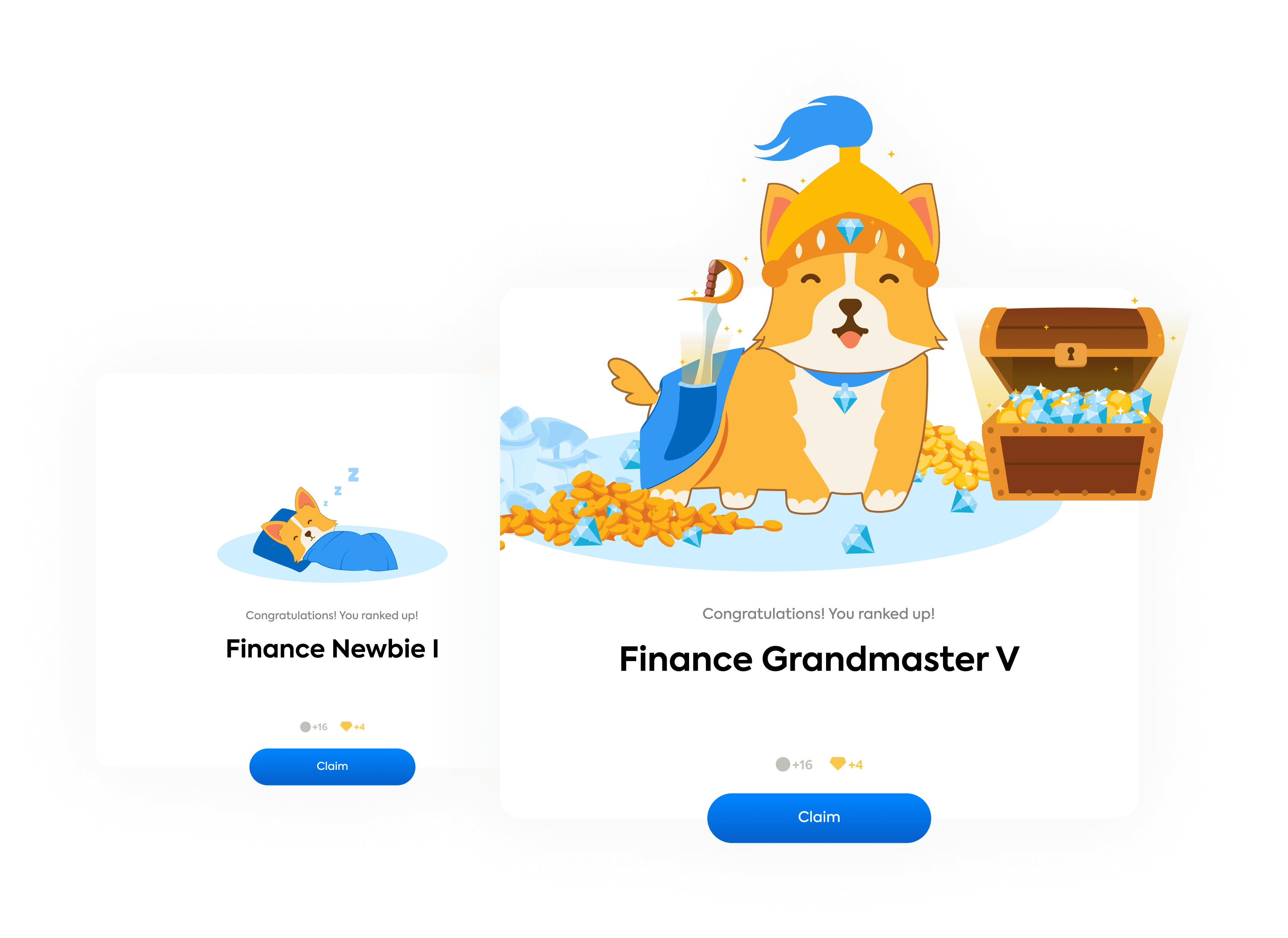
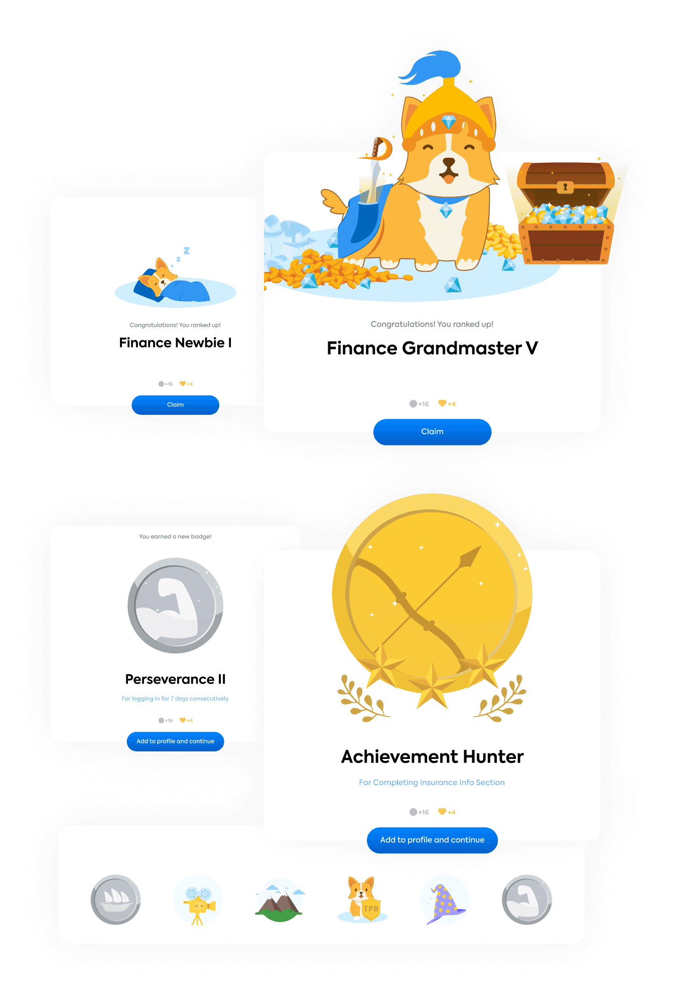
We introduced achievements and profile ranks to celebrate key milestones during the form process.
Users could earn up to 46 different badges — from accurately submitting policy details to answering quiz questions correctly.
These served as both motivation and reputation-building within the platform.
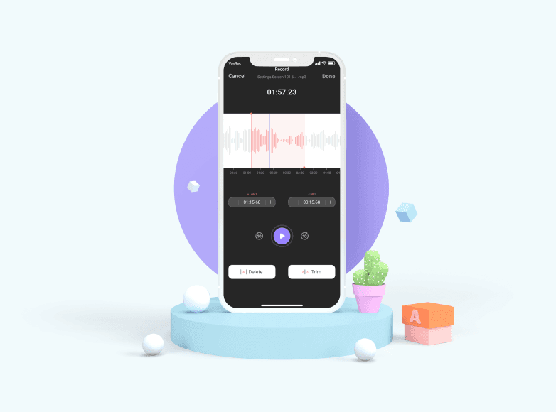
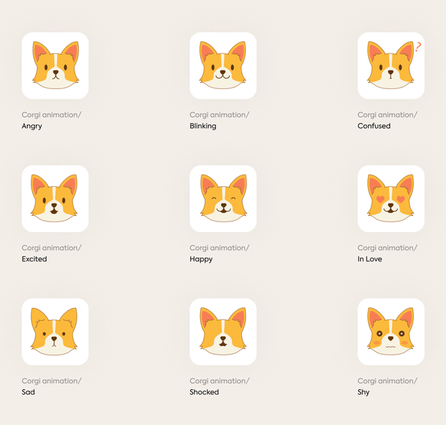
Entertaining illustrations
Candy, the site’s corgi mascot, was previously static — only pointing at important info.
We brought her to life with custom animations that responded to user progress and actions.
These delightful microinteractions added emotional connection, broke user fatigue, and made the journey more playful.
Formed solutions
Progressive Disclosure

Lazy registration ( Kairos )


Gamification and Entertaining illustrations
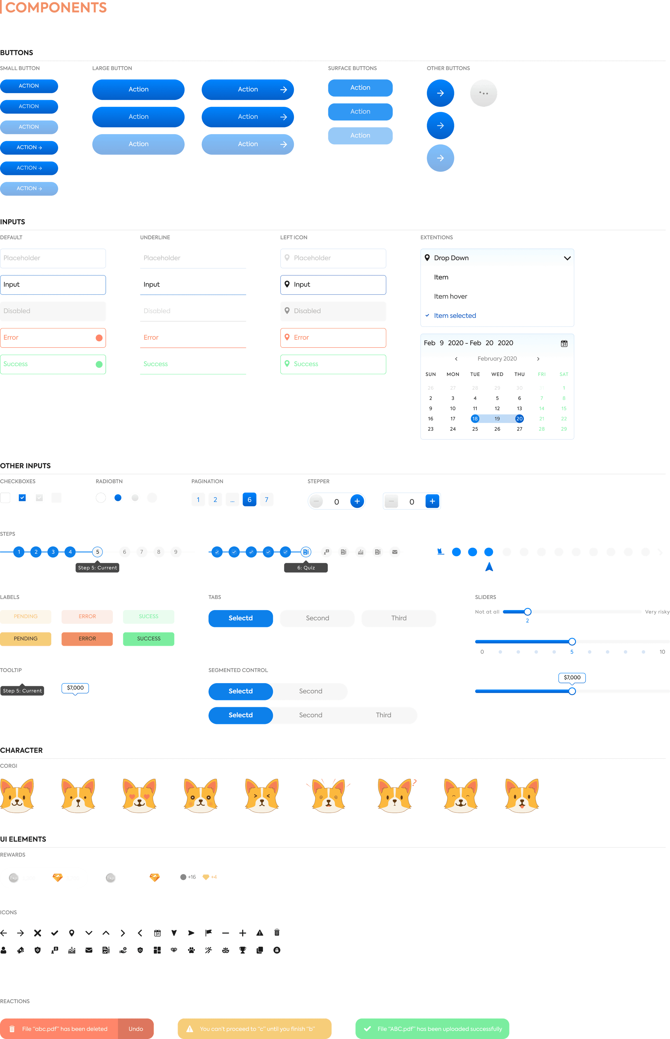
Style guide
We crafted a clean, friendly interface using AxiForma for clarity and structure, a color system that balances calm neutrals with expressive feedback, and simple, responsive components. To keep users engaged, we added light gamification and brought in Candy the Corgi as a playful guide throughout the flow.


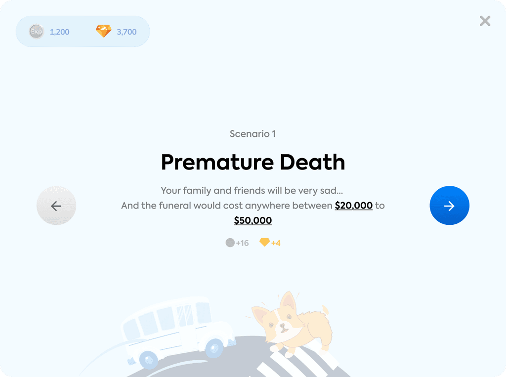
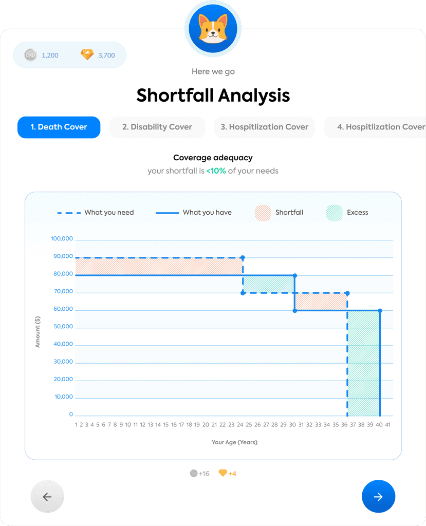
Scenario and Shortfall analysis
We used scenarios and a friendly mascot to soften serious topics and keep users engaged.
The step-based Shortfall Analysis simplified complex data into clear, guided comparisons.
Bright visuals and gamified cues helped users stay motivated throughout the journey.


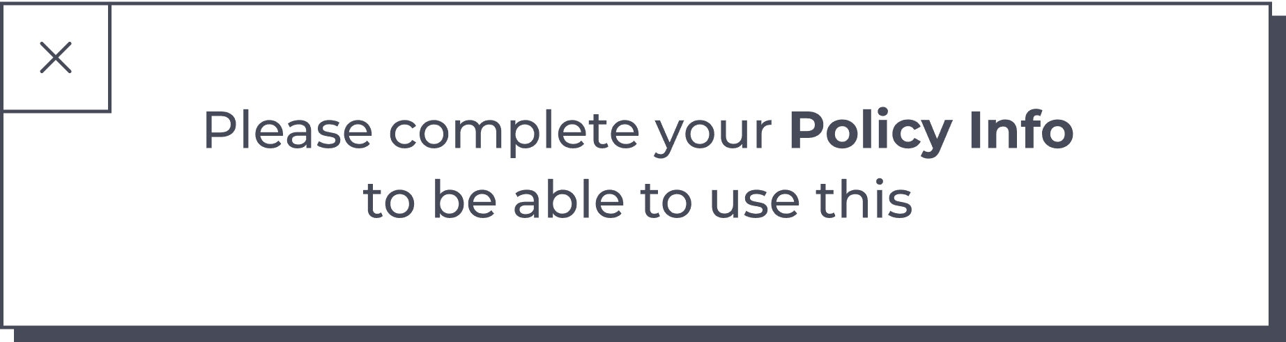
Policy info
We used scenarios and a friendly mascot to soften serious topics and keep users engaged.
The step-based Shortfall Analysis simplified complex data into clear, guided comparisons.
Bright visuals and gamified cues helped users stay motivated throughout the journey.


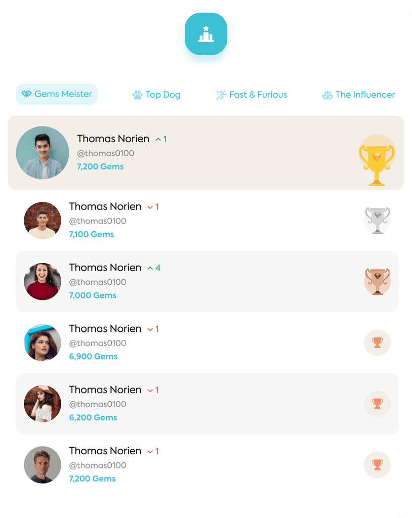
Dashboard
The dashboard brings all gamified elements together in one place — rank, achievements, and leaderboard — to reinforce progress and retention.
We kept the layout fun and social with friendly visuals, a daily question for interaction, and clear motivation to invite friends or earn more rewards.


Ranks and Achievements
Glimpse on how ranks and achievements are designed
Impact