2019 — WIREFRAME, UI MOCKUP, 2D ANIMATION
Clearly Surely

Singapore
OVERVIEW
A site that is focused on educating consumers about Life Insurance.
It is the only site that compares 7 product classes of Life Insurance - something that no other entity has ever come close to achieving.
DURATION
Oct 2019 - Mar 2020
Stopped due to COVID-19 Spread
MY ROLE
UX/UI Designer
Illustrator
2D Animator
TEAM MEMBERS

Your device is too small to view this page
Case studies are better be viewed on a Desktop or a Tablet. If you think you shouldn't see this message please let me know to fix this issue
Report it to Omar
Your device is too small to view this page
Case studies are better be viewed on a Desktop or a Tablet. If you think you shouldn't see this message please let me know to fix this issue
Report it to Omar
Problem
A low conversion was being detected between the number of users starting the registration process and the number of users who successfully complete it.
Clearly Surely’s new and potential users take too much time filling their personal and financial information which are mandatory to start analysing their financial situation.
Alan (Project Manager)’s customer interviews later showed that users either get bored or they get tired of filling in all this information, or they just close the window.
Marketing said they had to pay 6x more to get these users back and continue the process.
Research
What data do we want users to fill in?
= Low conversion
DESK RESEARCH
Registration info
Name
Phone number (and verification)
Email Address
Password
Personal Info
Set of 16-24 questions that measure user financial behaviors and knowledge
Quiz
2-5 questions to make sure the user is acknowledged of what type of financial service he is signing up for.
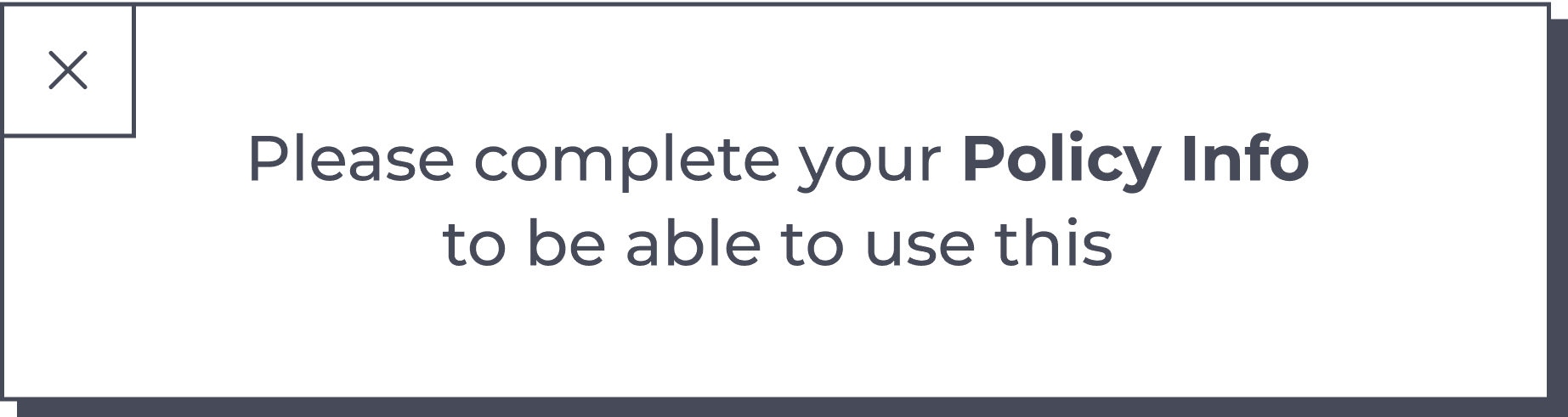
Policy Info
Type of policy
Relevant plan
Upload policy
Browse files and upload
Fill policy info manually
Policy info
Policy type
Company
Id
Policy number
Start date
Maturity date
Premium type and amount
Policy coverage
7 types of selectable coverage areas with their customized options based on type
Scenario Analysis
4 Scenarios that educate users of how much they gonna need in case of crisis like Premature Death and Serious illness
Shortfall Analysis (Results)
HMW…
Mainly I had two main problems here and stated them in two phrases:
How Might We make this process more engaging so Users Would Love To Do It?
How Might We make the users finish filling their personal and financial info in no more than two visits?
Suggested solutions
= Reduce effort
= Reduce boredom
Divide process into phases (Progressive Disclosure)
Divide phases into steps
Enable minimum features after few steps (Lazy Registration)
Rewards based on progress
Rank and Achievements
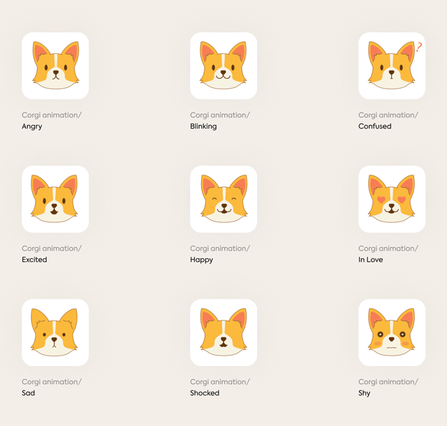
Use website character (Corgi)
Entertaining illustrations
Divide process into phases (Progressive Disclosure)

Helping users to detect where they’re, How much effort they still have to do, and empowers the need to complete progress.
Progress always show up after the user has already completed at least one phase; That’s how they feel encouraged to continue.
Estimated Efforts:
Easy To Implement
Estimated Impact:
Medium
Divide phases into steps

Adds another layer of progressive disclosure that makes users fully aware of their progress.
May backfire if it’s not well divided that it is too hard to step forward.
Estimated Efforts:
Easy To Implement
Estimated Impact:
Medium
Enable minimum features after a few steps ( Lazy Registration & Kairos design pattern )
Found out that some of Clearly Surely’s small features are easy to be enabled without having all of the user’s data.
AutoSave users’ progress would be useful for this practice.
Estimated Efforts:
Medium
Estimated Impact:
High
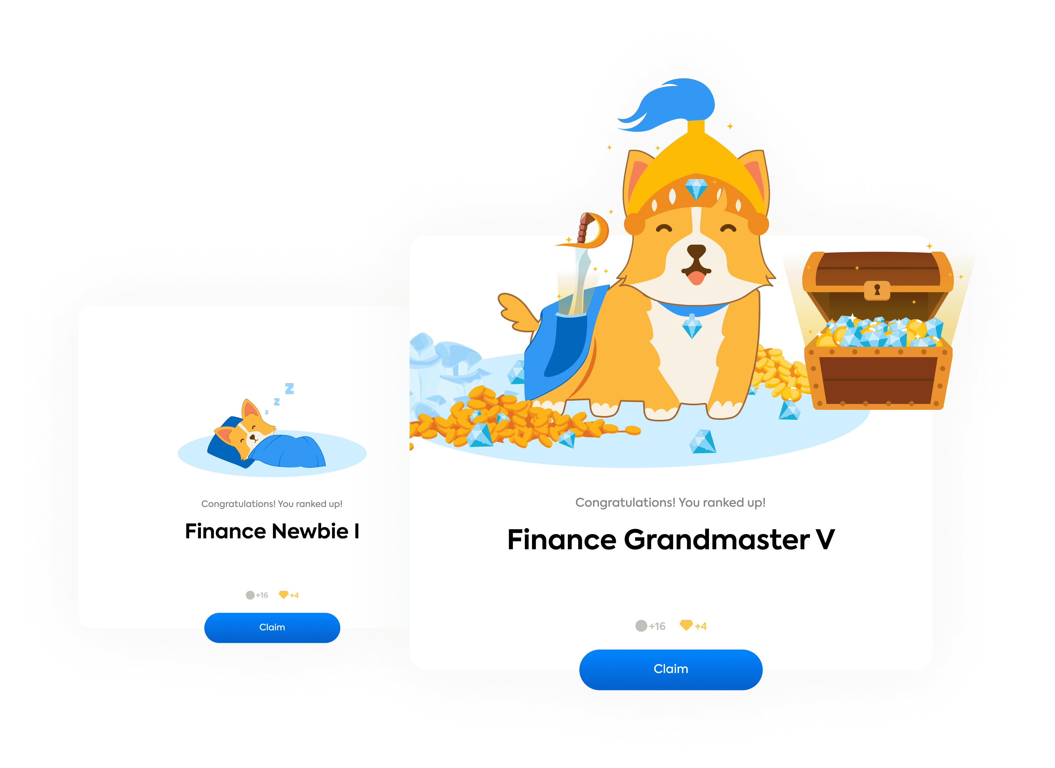
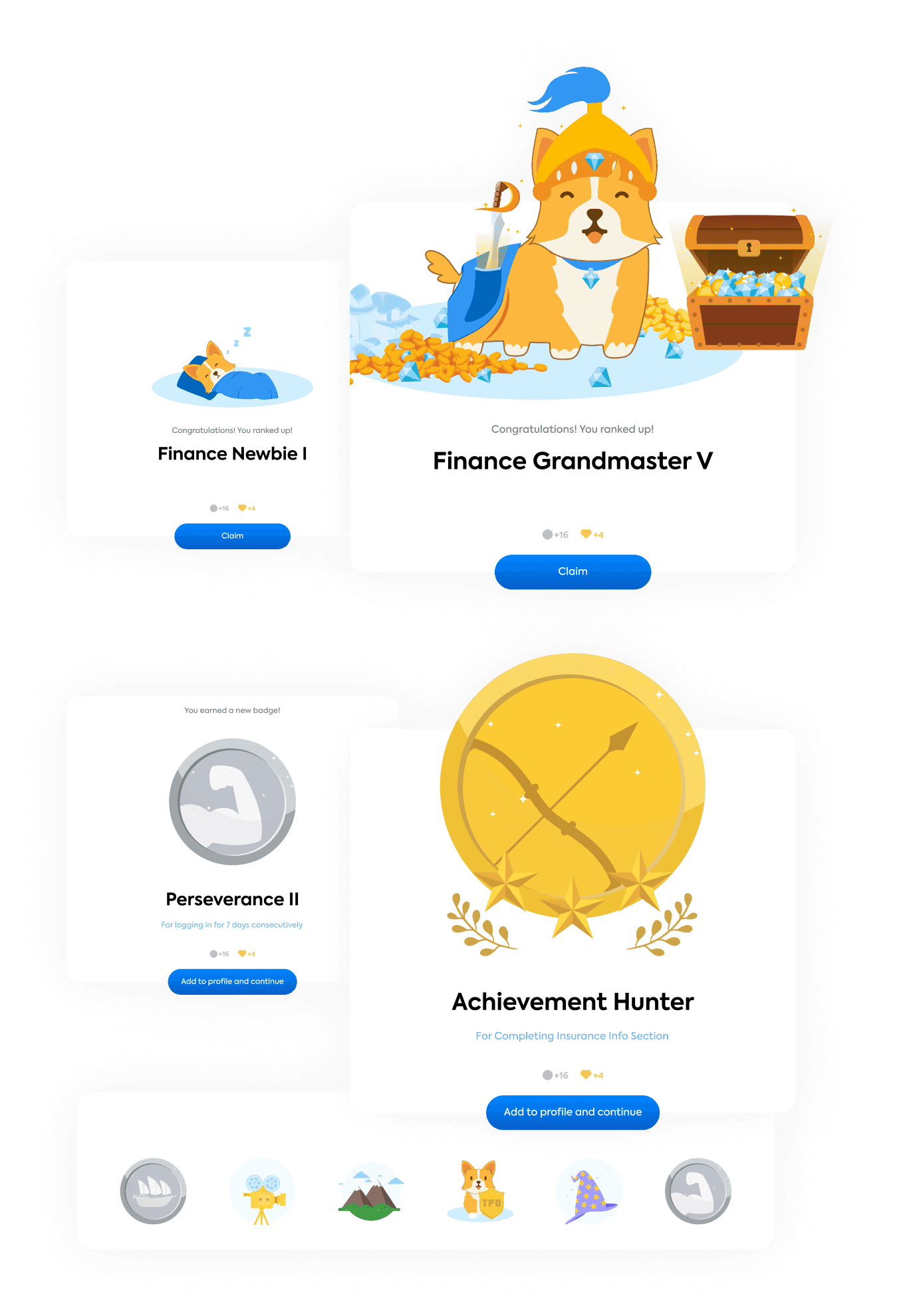
Rewards based on progress
Rank and Achievements

Adding a sort of gamification to the process may increase the chance that a user would complete their info efficiently.
It’d also impact their experience in the website after registration and work as activating method.
Estimated Efforts:
Medium
Estimated Impact:
High
Use website character ( Candy )
Entertaining illustrations
*My animation for introducing Candy for the first time to users
Candy ( The Corgi ) is the beloved character of the website, until now it’s only used to point on the important information only.
Using Candy to entertain users and increase engagement and lovability of the website was one of the solutions we all agreed on. And made some efforts to reduce development hassle in implementing it.
Estimated Efforts:
High
Estimated Impact:
High
Formed solutions
A) Progressive Disclosure

B) Lazy registration ( Kairos )

C) Gamification and Entertaining illustrations
Earning KPs and Gems after every step.

Every step and KP earned trigger a reaction by Candy based on the situation and your answers.
Every “Mission” fulfilled successfully awards the user a badge “Achievement”.
Users can gain up to 46 achievements badges and show them on their profiles.
They can also earn these badges by filling in extra info accurately.
All Coming Together
Adding Info Example Card


Policy info

Scenario analysis

Ranks and Achievements
COVID-19 spread on March 2020
Sadly we had to cut our journey short because of the unstable business status in Singapore due to the Covid-19 spread
Say
Hi
Say
Hi
Say
Hi